The before-and-after is the joke
Why the comparison slider is the most important UI element in the entire app, and why we almost didn't ship it.
2026-03-20
The first version of Puritanizer did not have a comparison slider. You uploaded a photo, waited a few seconds, got a result, and that was that. The result looked fine on its own. But nobody laughed.
We added the slider on day four and everything changed.
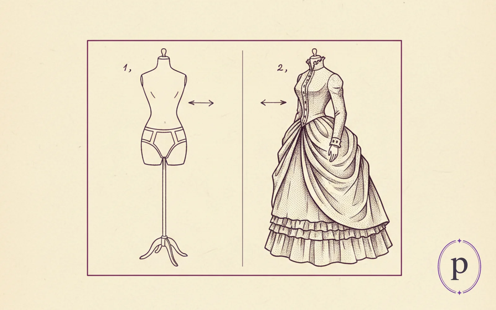
What the slider does
It shows the before-photo and the after-photo in the same frame, with a draggable vertical handle in the middle. Drag it left and you see the original. Drag it right and you see the puritanized version. You can sweep back and forth at any speed you like.
That is the whole component. It is not technically clever. A dozen off-the-shelf libraries do exactly this. We built ours in about an hour so we could control the feel of the drag precisely. The interesting part is not the implementation; it is what happens to the user when they see one.
Why it is funny and not just informative
Without the slider, a puritanized photo is a photo of someone in a nun habit. With the slider, a puritanized photo is a transformation. The viewer sees the original and the result side by side, does the mental arithmetic, and the punchline is that mental arithmetic. You can watch people discover the joke in real time — they drag the handle slowly, register the change, and then drag it rapidly back and forth three times while laughing. This happens every time. It is completely reliable.
A static after-image does not have a punchline. A before/after has the setup and the punchline, and the user operates the timing themselves. Making the user the one who reveals the joke is the single best thing you can do for the perceived humour of a tool like this.
The specific design details that matter
The handle is draggable and also the whole image is draggable. If you click anywhere on the image and drag, the handle follows your cursor. This sounds minor and it is not. Users try to grab the image and the handle slides, which feels correct. The alternative — only the handle is draggable, the rest of the image is static — is technically identical but feels worse.
The handle has a visible centre line and two small arrows. Without the arrows, users sometimes do not realise the handle is draggable and just look at the image. With the arrows, everyone gets it within one second. Three extra pixels of UI that buy a critical moment of affordance.
The default position is 50/50. Not 60/40. Not 70/30. Fifty-fifty means the first thing the user sees is "a photo cut in half with half of a nun habit on one side," which is intriguing enough to make them grab the handle without being so complete that the joke is already spoiled.
The reset button does not reset the slider. The reset button clears the whole result and lets you upload a new photo. If you want to reset the slider, you drag it back to the middle yourself. This is not a bug. It is a design choice to keep the interaction tactile and un-buttoned.
What we learned
The most important UI element in a novelty tool is the one that makes the joke land. It is not the upload button. It is not the result image. It is not the share buttons. It is the part where the user does the reveal themselves. Build that part as well as you can, because every other decision in the app is downstream of how good it feels.
Put some clothes on a photo.
Drop in any photo, pick an outfit from the catalogue, and Puritanizer paints it straight on. Face stays untouched. Two free with signup.
Open Puritanizer